
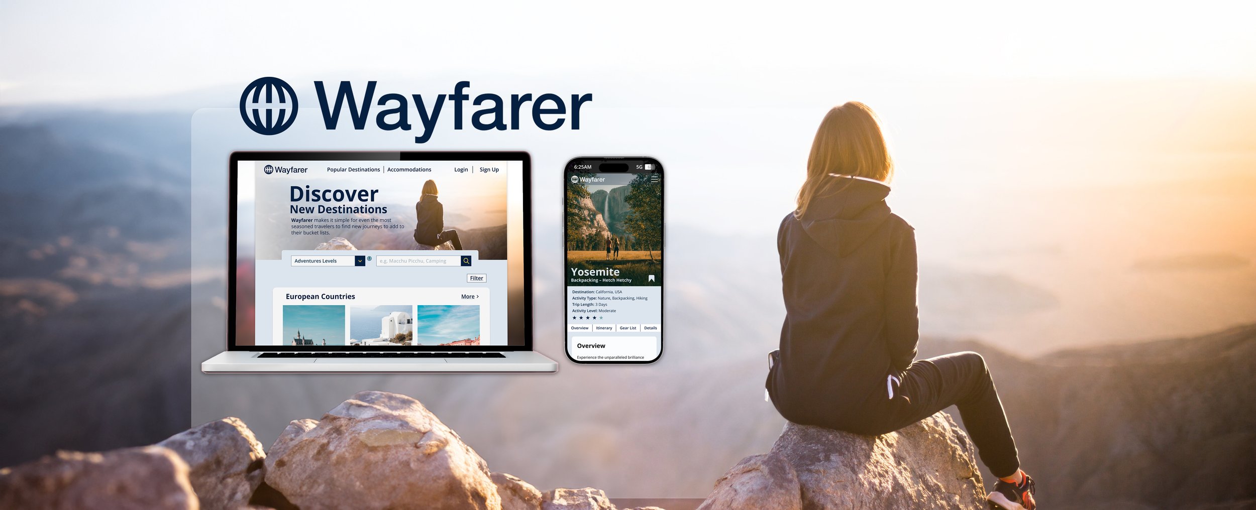
Wayfarer, a travel website, targets the 21-30 age group, assisting frequent travelers in discovering and planning adventures. Serving as a research source, it provides detailed information on destinations and accommodations, aligning with users' preferences for a personalized travel experience.

Key Adjectives:
Following an analysis of established travel websites, it became clear that our audience highly values trustworthy information, a stress-free traveling experience, and refreshing journeys in new destinations tailored to their preferences. As a result, I have encapsulated these adjectives to effectively embody the essence of our Wayfarer brand.
Refreshing
Comfort
Exciting
Reliable
Calm
Eye-opening
Low-Fidelity Wireframes

Color Selection
Based on my research-based adjectives, I chose dark blue as the primary color for its ability to convey reliability to our new audiences. To accommodate a reverse reading layout, I paired it with light blue (#DCE5ED). However, recognizing the need to infuse life and energy into the site, I opted for a complementary palette, selecting light orange (#F2C94C). This hue complements dark blue, creating a powerful visual impact, particularly in elements like buttons. To maintain a refreshing theme, I incorporated gray-blue as the neutral color.

Style TileAfter experimenting with various fonts, I settled on Open Sans, a widely used font on the internet known for its versatility and availability in different weights. I also reused icons, local components, and menu bars from a previous project. Finally, I paired colors from my library for high-contrast combinations on icons, buttons, and interfaces, ensuring a cohesive look.
Desktop Header with AI Enhanced Images 


Mobile Design 

